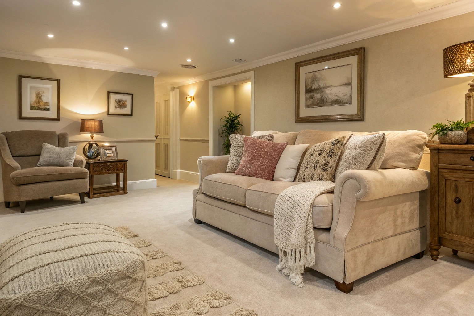
Neutral palettes have evolved far beyond the sterile white-on-white schemes of decades past, emerging as sophisticated design foundations that celebrate subtlety, texture, and architectural form. Today’s neutral approach embraces the full spectrum of understated hues—from warm greiges and soft taupes to rich charcoals and creamy off-whites—creating spaces that feel both timeless and deeply personal.
The misconception that neutral equals boring stems from a fundamental misunderstanding of how these versatile colors actually function in design. Rather than serving as mere backgrounds, neutrals become the canvas upon which texture, form, and light create visual drama. When I work with clients hesitant about abandoning bold colors, I often remind them that some of the world’s most stunning interiors and landscapes rely entirely on neutral foundations, proving that restraint can be far more powerful than excess.
Understanding the Modern Neutral Palette
The Science of Neutral Perception
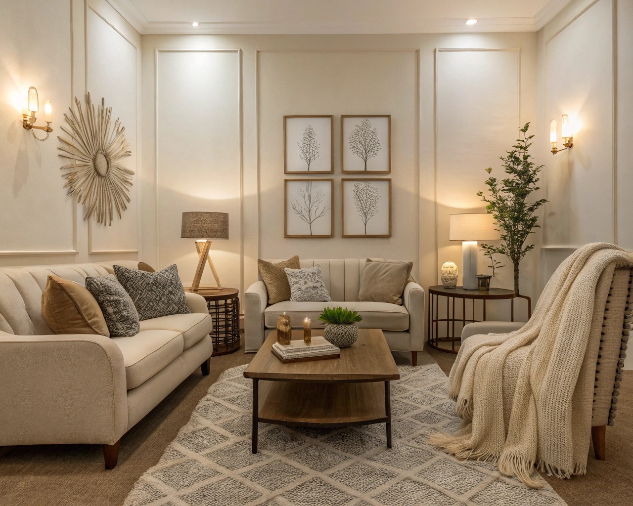
Neutral colors work by allowing the eye to focus on form, texture, and spatial relationships rather than competing for attention through chromatic intensity. These hues—typically defined as colors with minimal chromatic saturation—include the obvious suspects like beige, gray, and white, but extend to include muted versions of traditionally vibrant colors.
Warm vs. Cool Neutrals:
- Warm neutrals (beige, taupe, cream) contain yellow, orange, or red undertones, creating inviting, cozy atmospheres
- Cool neutrals (gray, greige, soft whites) feature blue, green, or violet undertones for crisp, airy feelings
- Balanced neutrals like greige offer the perfect middle ground, shifting in tone throughout the day as light conditions change
The key lies in understanding undertones—those subtle color influences that can dramatically impact how a neutral appears in different lighting conditions. A seemingly simple beige might reveal pink undertones in morning light or yellow undertones under warm evening illumination.
The Foundation Strategy: Building Your Neutral Base
Establishing Visual Hierarchy
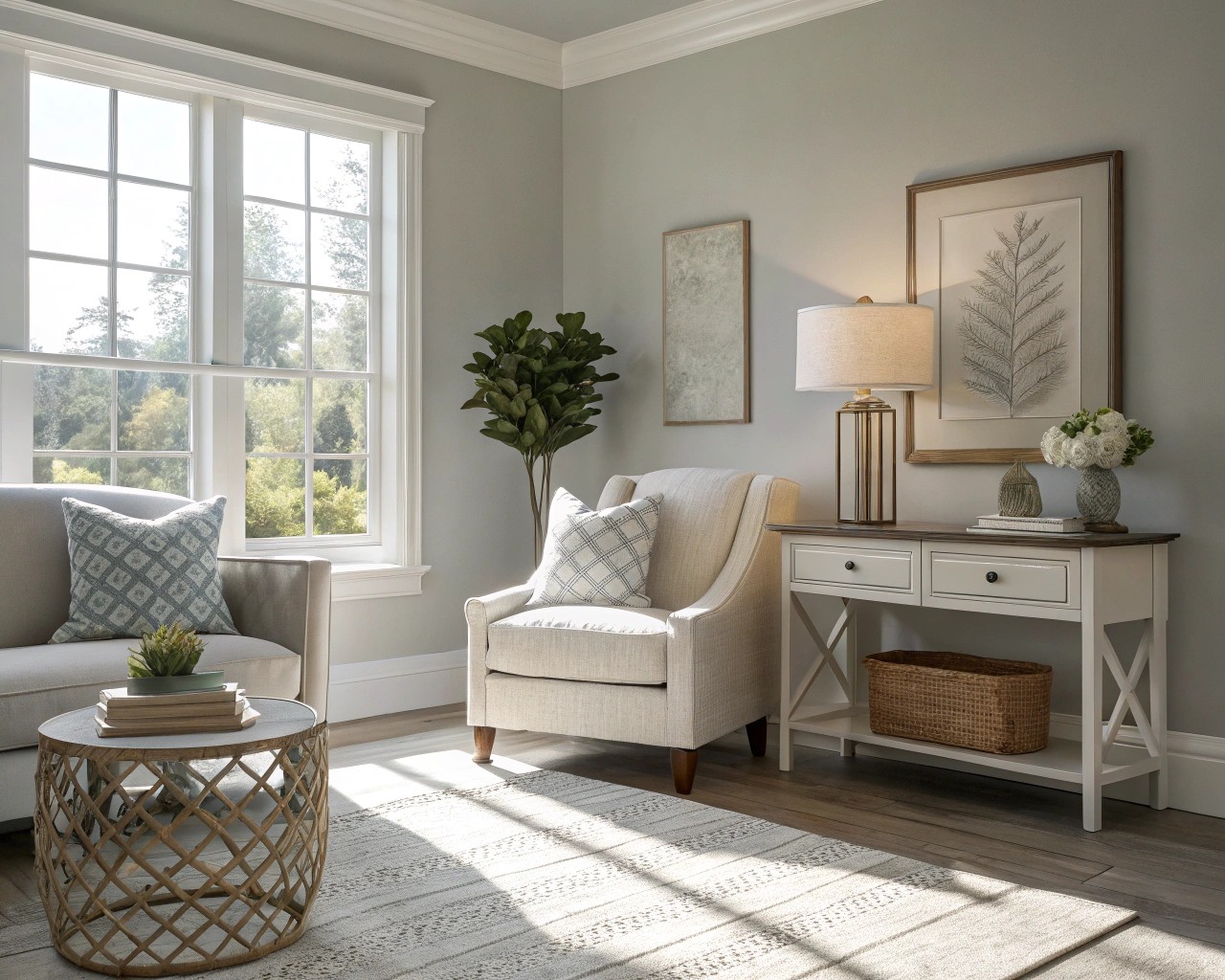
Every successful neutral scheme requires what I call a “dominant anchor”—a primary neutral that sets the entire mood for your space. This isn’t about choosing the lightest or darkest option; it’s about selecting the tone that best supports your design goals.
Steps for Choosing Your Dominant Neutral:
- Assess your space’s natural light exposure
- North-facing rooms benefit from warmer neutrals to counteract cool light
-
South-facing spaces can handle cooler grays and whites without feeling stark
-
Consider your architectural elements
- Existing wood tones, stone features, or metal finishes should harmonize with your chosen base
-
Use these permanent elements as undertone guides
-
Define your comfort zone
- Warm neutrals like Benjamin Moore’s Swiss Coffee create cozy, inviting atmospheres
- Cool neutrals such as Sherwin-Williams’ Neutral Ground offer sophisticated, contemporary feels
The 60-30-10 Neutral Rule
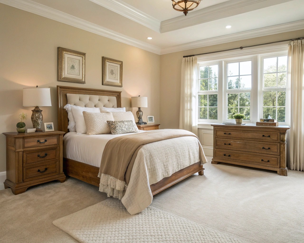
This classic design principle adapts beautifully to neutral schemes:
| Percentage | Application | Examples |
|---|---|---|
| 60% | Dominant neutral (walls, large furniture) | Warm greige walls, neutral upholstery |
| 30% | Secondary neutral (accent furniture, window treatments) | Darker taupe furniture, cream curtains |
| 10% | Accent neutral or near-neutral (accessories, art) | Black frames, deep charcoal pillows |
Texture: The Secret Weapon of Neutral Design
Material Mixing Mastery
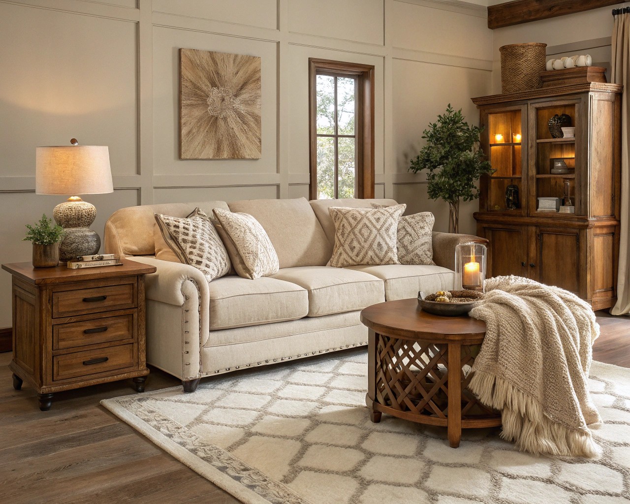
Texture becomes the primary source of visual interest in neutral schemes, replacing the role traditionally played by color contrast. The strategic combination of smooth and rough, matte and glossy, soft and structured creates the layered complexity that prevents neutral spaces from feeling flat.
Essential Texture Categories:
- Natural fibers: Linen, jute, wool, cotton create organic warmth
- Woven elements: Rattan baskets, wicker furniture, rope accents add tactile interest
- Stone and ceramics: Rough concrete, smooth marble, textured pottery provide structural contrast
- Metal finishes: Brushed brass, matte black iron, aged bronze introduce subtle luxury
In one recent project, I transformed a potentially sterile all-white kitchen by incorporating five distinct textures: honed marble countertops, brushed oak cabinetry, woven pendant lights, linen window treatments, and hammered copper hardware. The result felt rich and layered despite using only three paint colors.
The Layering Technique
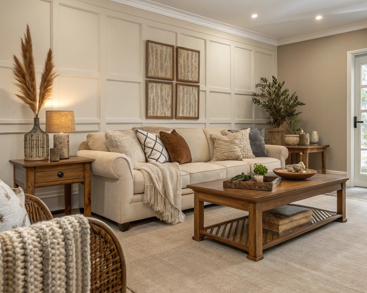
Successful neutral layering follows specific principles that I’ve refined through years of practice:
The Three-Layer Rule:
1. Base layer: Largest surfaces (walls, floors, ceiling)
2. Accent layer: Medium-sized elements (furniture, rugs, major textiles)
3. Detail layer: Smallest touches (throw pillows, artwork, decorative objects)
Each layer should introduce either a tonal variation or textural contrast—ideally both. For example, cream walls (base) might be paired with a taupe sectional sofa with nubby fabric (accent) and charcoal velvet throw pillows (detail).
Mastering Neutral Contrast
Strategic Use of Dark Accents
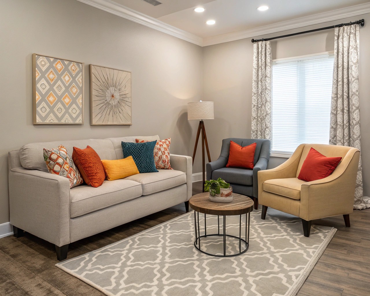
The most sophisticated neutral schemes incorporate what I call “punctuation points”—strategic placements of deeper tones that anchor the space and provide visual weight. Black remains the most effective neutral contrast color, offering sharp definition without chromatic competition.
High-Impact Dark Accent Applications:
- Window trim and door frames
- Picture frames and artwork matting
- Light fixture finishes
- Hardware (cabinet pulls, faucets, doorknobs)
- One statement furniture piece per room
The Power of White Space
Negative space—areas deliberately left unadorned—serves as a crucial design element in neutral schemes. This isn’t about empty rooms; it’s about purposeful restraint that allows key elements to breathe and make stronger statements.
Effective White Space Strategies:
- Visual breathing room: Maintain clear sight lines between furniture groupings
- Architectural emphasis: Allow beautiful moldings, beams, or built-ins to stand unobstructed
- Textural showcasing: Give high-texture elements space to be appreciated individually
Incorporating Natural Elements
Biophilic Design in Neutral Schemes
Natural elements serve dual purposes in neutral interiors: they introduce organic textures while adding the subtle color variations found in wood grain, stone patterns, and plant life. These elements prevent neutral spaces from feeling artificial or sterile.
Key Natural Additions:
- Live plants: Choose varieties with interesting foliage shapes and textures rather than bright flowers
- Architectural plants: Snake plants, fiddle leaf figs, monstera deliciosa
- Textural interest: Ferns, hostas, various succulents
-
Hanging varieties: Pothos, string of pearls, trailing ivy
-
Raw materials: Incorporate elements in their natural state
- Reclaimed wood beams or furniture pieces
- Natural stone accents or feature walls
-
Unfinished metal elements with natural patina
-
Water features: The sound and movement of water adds sensory richness without visual clutter
Pattern and Neutral Schemes
Subtle Pattern Integration
Patterns in neutral schemes require more finesse than in colorful rooms, but when executed correctly, they add sophisticated visual interest without disrupting the calm foundation.
Effective Neutral Patterns:
| Pattern Type | Best Applications | Examples |
|---|---|---|
| Geometric | Rugs, throw pillows, wallpaper accents | Subtle herringbone, simple stripes |
| Organic | Window treatments, upholstery | Soft florals, leaf motifs in tonal variations |
| Textural | Wall treatments, fabrics | Grasscloth, subtle damask, embossed designs |
The key principle: patterns should be discernible but not dominant. If you squint at a pattern and it nearly disappears into the background, it’s perfectly scaled for a neutral room.
Lighting: The Neutral Game-Changer
Layered Lighting Strategy
Lighting can make or break a neutral scheme. Poor lighting renders neutral spaces flat and lifeless, while thoughtful illumination creates depth, warmth, and visual interest throughout the day.
The Four-Layer Lighting Approach:
- Ambient lighting: Overall room illumination through ceiling fixtures or recessed lights
- Task lighting: Focused illumination for specific activities (reading lamps, under-cabinet lighting)
- Accent lighting: Decorative elements that create visual interest (wall sconces, picture lights)
- Natural lighting: Maximized and controlled daylight through window treatments
Neutral-Friendly Lighting Tips:
- Use warm LED bulbs (2700K-3000K) to prevent cool neutrals from feeling stark
- Install dimmer switches to adjust intensity throughout the day
- Choose fixture finishes that complement your metal accent strategy
- Position lighting to highlight textural elements and create shadow play
Outdoor Neutral Applications
Landscape Design with Neutral Palettes
Neutral principles apply equally effectively to outdoor spaces, where they create sophisticated, calming environments that complement rather than compete with natural surroundings.
Neutral Landscape Elements:
- Hardscaping materials: Natural stone, concrete pavers, weathered wood decking
- Plant selections: Focus on foliage texture and form rather than flower color
- Ornamental grasses for movement and texture
- Structural evergreens for year-round interest
-
Plants with interesting bark or stem colors
-
Color palette: Stick to greens, grays, whites, and natural stone tones
Monochromatic Garden Design
Single-color garden schemes represent the ultimate neutral approach to landscape design. These gardens achieve impact through form, texture, and tonal variation rather than chromatic contrast.
Creating Effective Monochromatic Gardens:
- Choose your base color family (all whites, all greens, all silver-grays)
- Vary the tones within that family (pale to deep variations)
- Emphasize different textures and plant forms
- Include foliage that contributes to your color scheme
- Plan for seasonal interest through structure and evergreen elements
Practical Implementation Strategies
Room-by-Room Neutral Applications
Living Spaces:
- Start with a neutral foundation (walls, large furniture pieces)
- Layer in 3-5 different textures through textiles and accessories
- Add one dark accent element for visual anchoring
- Include living plants for organic variation
Bedrooms:
- Use the lightest neutrals for a serene, restful atmosphere
- Layer bedding in varying neutral tones and textures
- Incorporate natural wood elements for warmth
- Keep patterns subtle and organic
Kitchens:
- Balance cool and warm neutrals through material choices
- Use natural stone or wood to add textural interest
- Choose hardware and fixtures as accent opportunities
- Consider one statement element (backsplash, island color)
Budget-Friendly Neutral Transitions
High-Impact, Low-Cost Changes:
- Replace colorful throw pillows with neutral textured versions
- Add natural texture through baskets, woven placemats, or jute rugs
- Paint existing furniture pieces in neutral tones
- Incorporate plants and natural elements for organic interest
- Use neutral-toned artwork or photography
Medium Investment Upgrades:
- Replace window treatments with natural fibers in neutral tones
- Add one major textural element (area rug, throw blanket, accent furniture)
- Update light fixtures to complement your neutral metal strategy
- Introduce natural wood elements through furniture or architectural details
Troubleshooting Common Neutral Challenges
Avoiding the “Beige Box” Syndrome
The most common neutral mistake involves using too few tonal variations, creating flat, uninspiring spaces. Prevention requires intentional contrast and textural variety.
Solutions:
- Use at least three different neutral tones in each space
- Vary the finish types (matte, satin, glossy) across different elements
- Include at least one very light and one relatively dark neutral per room
- Add organic shapes to balance angular furniture and architecture
Managing Undertones
Conflicting undertones can make neutral schemes feel disjointed or muddy. Success requires understanding how different neutrals interact under your specific lighting conditions.
Undertone Management Tips:
- Test paint colors and fabric samples in your actual space under different lighting conditions
- Stick to either warm or cool undertones within each room (mixing is advanced technique)
- Use natural elements to bridge any slight undertone variations
- Remember that lighting can dramatically affect how undertones appear
The beauty of neutral design lies not in its simplicity, but in its sophisticated restraint. When executed thoughtfully, neutral schemes create spaces that feel both timeless and deeply personal—environments that celebrate the interplay of light, texture, and form rather than relying on chromatic drama. These spaces evolve gracefully over time, adapting to changing needs and preferences while maintaining their essential calm and elegance.
By focusing on the fundamental principles of tonal variation, textural layering, and strategic contrast, anyone can create neutral environments that feel rich, dynamic, and utterly engaging. The key lies in understanding that neutral doesn’t mean uniform—it means harmonious, allowing each carefully chosen element to contribute to a greater, more sophisticated whole.

